First of all in the hotel design designers to do a good job of warm colors and cool colors of the match, and give full play to the beauty of color, color to make people easy to accept. Remember not to exaggerate, designers can not according to their own imagination to match, according to the hotel's decoration style and pattern distribution to a reasonable match.
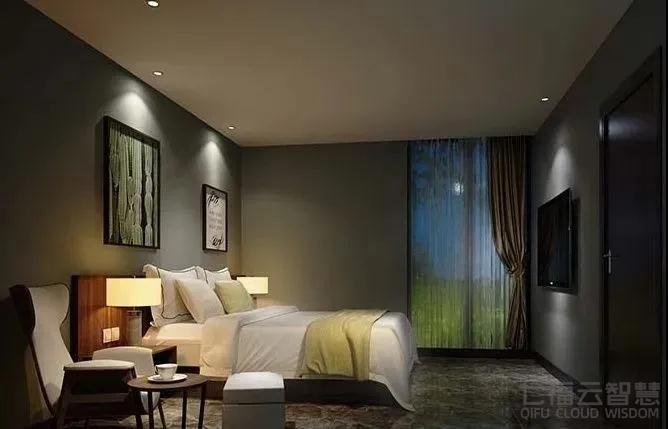
In the hotel design, harmonious color collocation can make people happy, to bring a pleasant aesthetic feeling. So in the hotel decoration design color matching what skills?
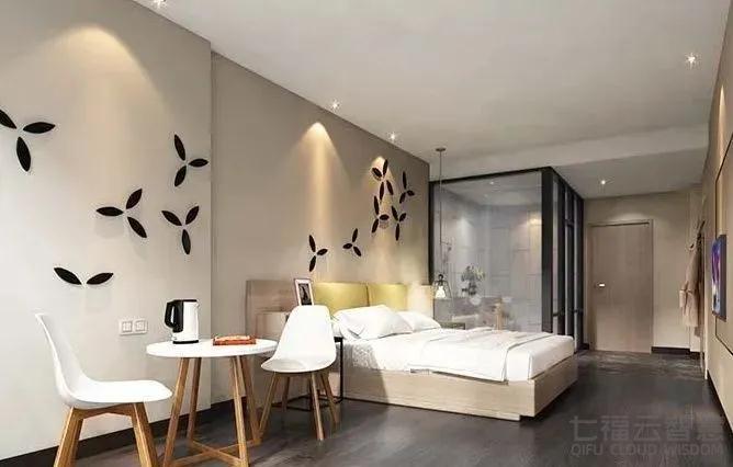
First of all in the hotel design designers to do a good job of warm colors and cool colors of the match, and give full play to the beauty of color, color to make people easy to accept. Remember not to exaggerate, designers can not according to their own imagination to match, according to the hotel's decoration style and pattern distribution to a reasonable match.
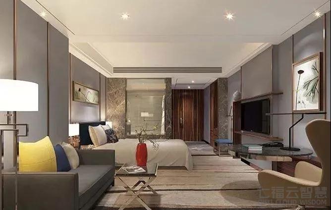
The main contents of color composition are: color characteristics, color harmony, color contrast and color association and symbol. The color of this way of composition is the rational color that should be considered deeply. It is different from the subjective perceptual color in pure painting. Master the rules of color matching. The flexibility that matchs to colour is having main effect.
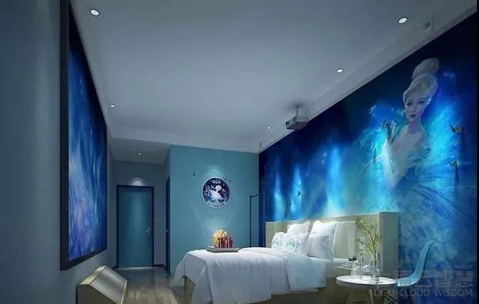
If we want to design the hotel in a warm and quiet style, then we can consider warm colors. Try to use some light colors like orange. Do not use exciting, sharp colors. This will give people a feeling of antipathy, resistance.
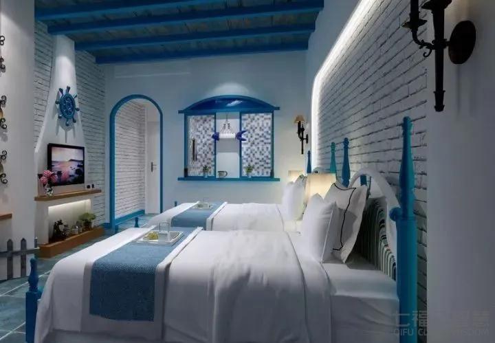
Secondly, the color design of hotel rooms should make most travelers feel comfortable. In the use of color, people have the general character to the feeling of certain color. So, choose color. In particular, choose a fundamental color. Look for common color combinations. To meet the visual needs of different travelers... When choosing a hotel, customers will first look at the hotel design style and whether it gives people comfort. So colorific collocation will consider even according to local climate and regional style. Don't mix and match blindly.
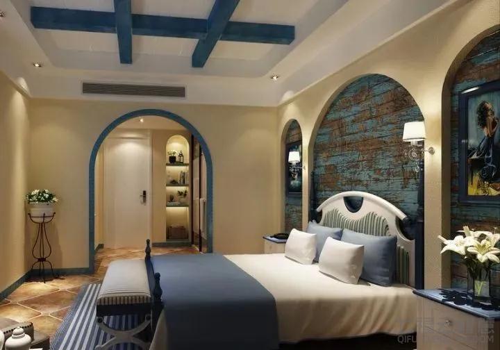 Color design is to choose a main tone, and then design other tones according to the main tone. And the choice of main tone needs to be combined with the design style of the hotel and the needs of people to choose. Indoor color will affect the customer's mood, consciousness and thinking. Color has an important effect on blood pressure and temperament. Some colors make people feel comfortable, some make people feel relaxed, some make people feel depressed, some increase mental activity and some decrease it. Yellow, orange, and red are called warm colors. These colors make people feel warm and happy psychologically. Blue, purple and green are called cool colors and they are calming. Therefore, make sure you choose the right color in your design.
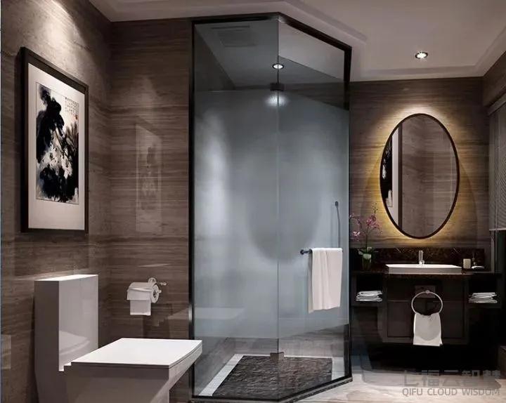
Hotel design process, as long as the scientific grasp of the basic function of light and color, and then combined with the size of the interior space, interior space functional requirements and decorative design requirements, through the light and shade of the mutual collocation carefully designed, will be able to create an unexpected effect.
In terms of hotel interior design, imagination, emotion and understanding are equally important; The sense of color in the hotel space design, as important as color to the painter. Color is a tool used by the designer to convey to the user the information he wants to convey. Like all communication tools, too much stimulation can make people feel confused. The meaning of color varies not only with the occasion, but also with The Times.
Color collocation plays a key role in hotel design, so in the process of decoration to make a good plan in advance, so as to ensure that the effect of decoration out of the people comfortable, comfortable, almost perfect.
Contact: Miss Su
Phone: 13677396963
Tel: 0731-85124218
Email: seven@qifu3d.com
Add: Building 5B, Liandong U Valley ,Xueshi Street, Changsha ,Hunan ,China